Designing for Meaning: Behind the FDIC Rebrand Strategy
- Feb 22
- 3 min read
Updated: Mar 6

Challenge & Solution
Challenge —
As the Fire Department Instructors Conference (FDIC) continues to set the standard for excellence in the fire service, the event must do more than showcase new tools—it must cut through complexity, align diverse stakeholders, and clearly communicate innovation in a high-stakes industry where clarity, trust, and performance matter.
With hundreds of exhibitors and thousands of attendees converging at the Indiana Convention Center, the challenge was to translate technical innovation into clear value, ensure brands stood out without noise, and support the life-saving mission at the core of the fire service.
Solution —
I applied a strategy-led creative process to bring focus, clarity, and purpose to the experience.
Using a comprehensive framework I learned at ArtCenter College of Design, Masters of Brand Design & Strategy, I reframed the problem from “how do we promote products?” to “how do we support firefighters with insight, relevance, and trust?” This strategic foundation guided every creative decision, ensuring the final work aligned business objectives, audience needs, and the mission-driven nature of the industry.
Rebranding FDIC International wasn’t about refreshing visuals for novelty’s sake. It was about clarifying purpose, strengthening recognition, and building a system that could scale across a complex, global event ecosystem—while staying grounded in the lived realities of the fire service.
From the outset, I approached the work through a strategy-first lens. Before touching typography or color, I focused on the brand’s core truth: FDIC exists to support firefighters in moments where preparation directly translates into lives saved. That insight became the anchor for every decision that followed, ultimately expressed through the unifying idea “Designed to Save Lives.”
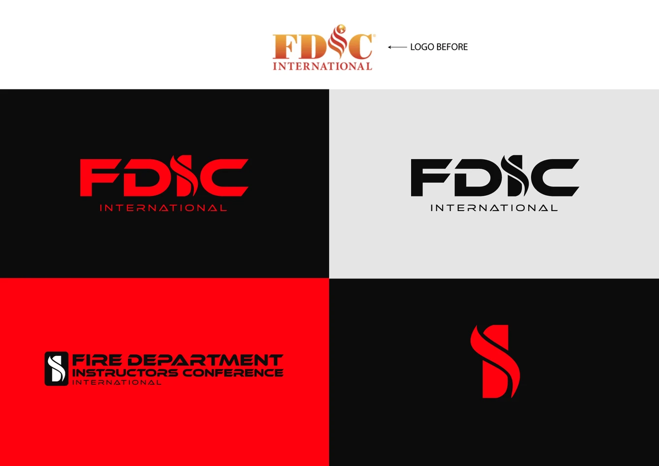
From Symbol to System
One of the earliest frameworks guiding the rebrand was propositional density—the idea that a mark should communicate maximum meaning with minimal elements. The updated FDIC logo was intentionally engineered to do just that: the “F” abstracted into a firefighter’s axe, the flame integrated into the letterform, and a structure that feels both modern and battle-tested. Each element carries symbolic weight while remaining legible at any scale, from digital to large-format environmental signage.

This thinking extended beyond the logo into a modular identity system. Multiple lockups, flexible compositions, and consistent spacing rules allow the brand to adapt across platforms without losing coherence—critical for an event that lives simultaneously online, on-site, and in motion.
Human-Centered, Not Hero Worship
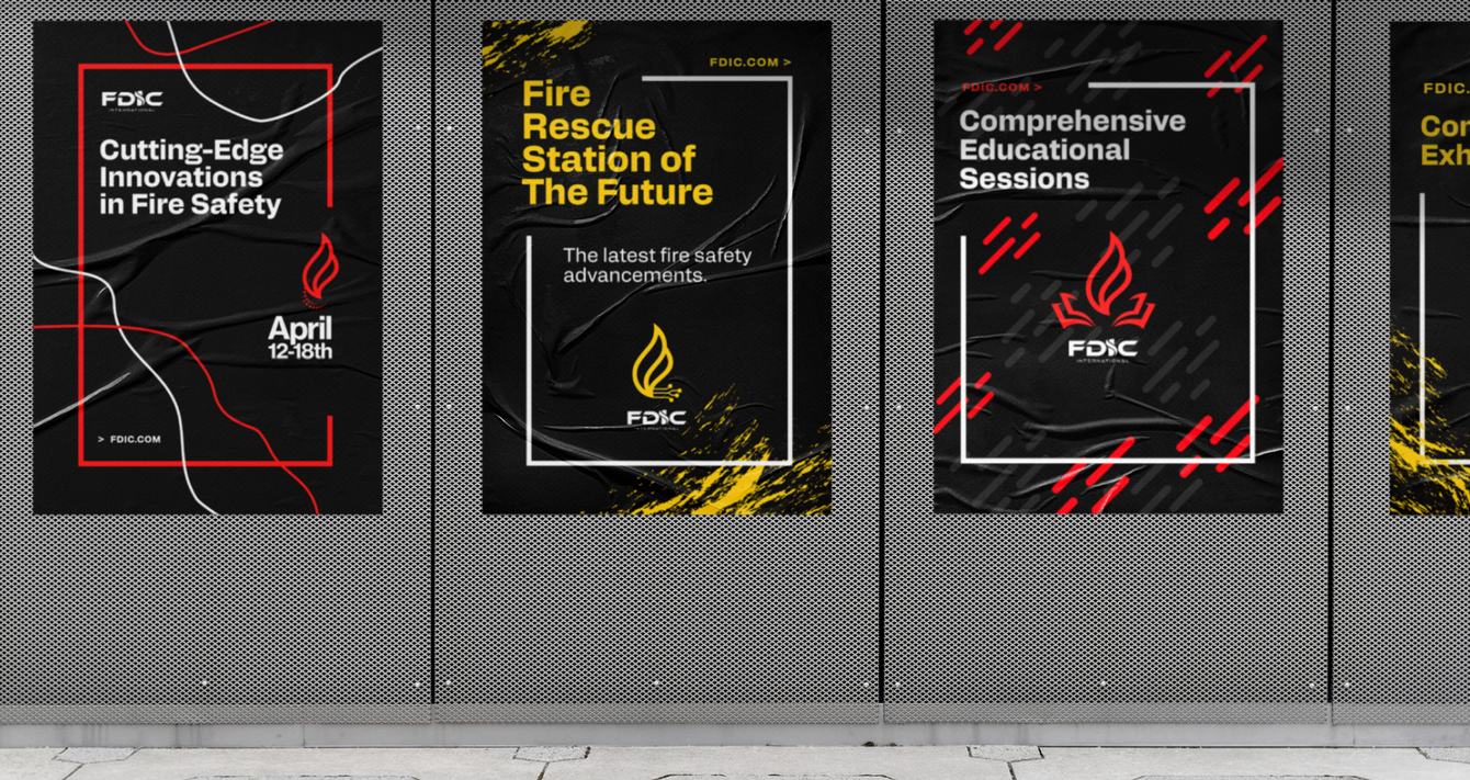
Another guiding principle was human-centered storytelling. FDIC is about firefighters, not abstractions. The photography system intentionally balances action with reflection—capturing moments of intensity, service, connection, and quiet resolve. Black-and-white imagery introduces emotional gravity and timelessness, while selective color treatments and graphic overlays create continuity with the broader identity system.
Even details like patterns and textures were grounded in meaning. The amber tones in the FDIC brand reference glowing fire embers—symbols of endurance, awareness, and renewal. Beyond what remains after the flames, embers signal the conditions for new growth, reinforcing the idea that learning, preparation, and shared knowledge create safer outcomes long after the moment of crisis.
Designing for Access and Inclusion
Accessibility was treated as a design requirement, not a constraint. Color decisions were tested for color-blind safety, typography prioritized readability, and contrast ratios were carefully controlled. Small adjustments—like modifying traditional fire-engine red for digital accessibility—help ensure the brand communicates clearly to the widest possible audience.
This mindset reflects a broader belief: strong brands don’t exclude; they clarify.
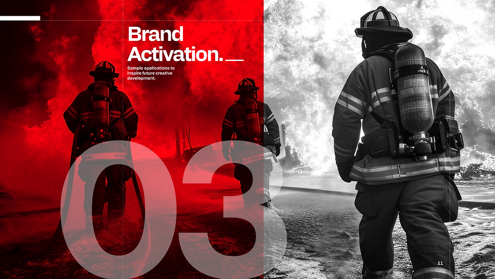
Activation as Proof
Finally, the strategy was validated through activation. Stationery, signage, apparel, environmental graphics, digital experiences, and even merchandise were treated as proof points—not add-ons. Each application reinforces the same idea: FDIC is disciplined, modern, and purpose-driven, while still honoring the grit and humanity of the profession it serves.
In the end, the FDIC rebrand is less about aesthetics and more about alignment—aligning mission, message, and medium into a cohesive system that can evolve over time. For me, that’s what effective brand design looks like: not just something you see, but something you feel, trust, and remember—especially when it matters most.


(Contact me to view the FDIC brand guidelines.)