Recasting a B2B Experience as a Premier Executive Network
- Feb 22
- 4 min read
Updated: Apr 28

Challenge & Solution
Challenge —
Reposition Quartz Network’s B2B organization through a strategic rebrand that preserved the trust and loyalty of its established executive audience. The objective was to build on the brand’s differentiated one-to-one executive meetings model while introducing a modern, technology-forward design system and communications language aligned with the expectations of today’s industry leaders.
Solution —
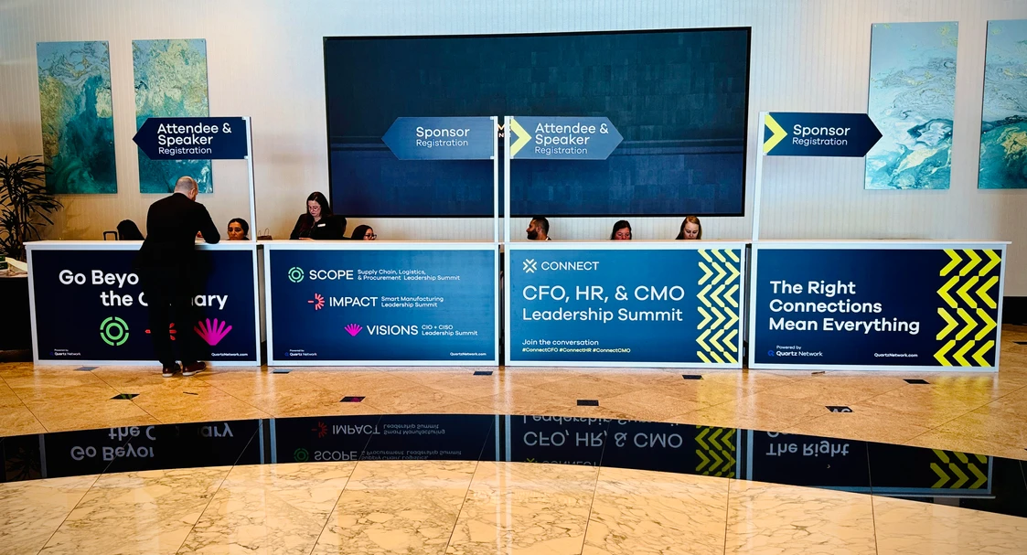
Collaborating closely with the Quartz Network executive team, I co-led an immersive brand exploration to uncover the core narrative and nuanced behavioral traits that shape the brand’s identity, voice, and tone. This strategic deep dive informed a comprehensive creative direction across 16+ annual B2B events in 8 sectors, ensuring alignment of all brand expressions—from logo evolution to modern textures and color systems in marketing materials. The result was a 20–30% increase in brand consistency and audience engagement across all touchpoints.
Quartz Network had built a strong reputation through high-value executive events and curated experiences, but its identity and messaging didn’t fully reflect the strategic value it delivers to senior leaders. In a competitive landscape where leaders care about clarity, relevance, and differentiated experience, the brand needed to anchor itself in its own strategic reality.
Strategic Insight: Find Your Edge
Early in the discovery process, we uncovered something critical: the audience, senior executives and thought leaders, doesn’t attend “trade shows.” They seek targeted intelligence, high-quality curated connections, and measurable outcomes. That insight shaped the strategic narrative.
Drawing from the fact that Quartz Network is a business community that helps ambitious professionals connect and grow, we anchored the brand story around “Find your edge.” This line reframes the purpose from event attendance to personal and organizational advancement, stepping outside comfort zones to discover competitive advantage. The edge narrative became a strategic north star for visual language, messaging, and experience design.
Defining the Brand Architecture
A key finding in the strategy phase was brand fragmentation. While individual event brands had recognition, the masterbrand lacked clarity. That ambiguity diluted equity and made it harder to scale into new verticals or categories.
The rebrand strategy clarified the relationship between the masterbrand and its sub-brands, creating a coherent architecture that:
Signals premium executive exchange
Ensures consistency across verticals
Elevates each event’s unique value while tying it to the platform’s larger purpose
This strategic structure transformed Quartz Network events into a unified executive ecosystem.
Identity as Strategy
The visual identity became a strategic asset. We developed a reductive and geometric mark that blends the letters “Q” and “N,” embedding a quartz crystal form within the negative space, a metaphor for refinement, clarity, and strength at the core of what the brand delivers. Instead of decorative design, the mark functions as a visual shorthand for the brand promise.
We expanded that form into a 3D toolkit of sharp refractions and expressive typography, bringing edge to life across touchpoints, from digital to physical experiences.
Experience and Messaging Alignment
Executives evaluate value quickly and strategically. General trade show language, lists of speakers, logistical details, generic branding, doesn’t resonate at that level. Our strategy shifted the messaging from features to outcomes: curated connections, thought leadership, tailored content, and measurable business impact.
We also prioritized an immersive digital experience rooted in clarity and purpose. The new UX strategy and web design reorganized content around:
Strategic outcomes
Curated experiences
Clear narrative hierarchy
Moving beyond template thinking, the website became an extension of the brand’s strategic promise rather than a repository of event information.
Strategic Findings That Mattered
1. Language shapes perception.
By replacing transactional event language with outcome-oriented messaging, we reoriented how clients and prospects understand value.
2. Architecture unlocks scale.
A coherent brand hierarchy set the stage for expansion into new verticals without diluting the masterbrand.
3. Identity conveys position.
Visual metaphor and custom treatments signaled executive sophistication and strategic purpose — not just aesthetics.
What This Rebrand Achieved
The Quartz Network rebrand became more than a visual update. It:
Clarified the strategic narrative for executive audiences
Created a scalable architecture for long-term portfolio growth
Reinforced messaging around competitive advantage and curated experience
Recast perception from “trade show organizer” to “strategic executive network”
This project reinforces the core principle of effective rebranding: it isn’t about a new logo or color palette, it’s about aligning brand expression with a business’s actual strategic value. When a brand accurately reflects its value in visual language, communications, and system architecture, it not only stands out, it resonated with the target audience.


(Contact me to view the QN brand guidelines; developed in collaboration with Moving Brands.)